I developed a new way of handwriting during the first few months of Bullet Journaling. As one of my own requirements is that my Bullet Journals should be well readable and look good, and my original handwriting does not meet this standard.
Actually, I can still write those beautiful standard joined handwriting characters we learned in Primary School, but it takes so much time to write them… over the years this handwriting developed – or degenerated – into an ugly fast way of writing. Not usable in my Bullet Journals.
This mutilized handwriting was one of those itchy entries on my list of personal dissatisfactions for which I had no reason to improve, as we’re into using computers now, right? But it turned out that after the first few pages of my first Bullet Journal I knew: this handwriting ought to change.
I quickly moved into using capitals exclusively, which immediately looked cleaner. My first conclusion though, was that it came with a cost in writing speed. But there was no way back: it still looks good and it feels good.
In order to gain back some writing speed I decided to focus on details: while writing in capitalization I found week spots for which I sought improvements. In general these are:
- lift the pen as few times as possible
- try to write each character in one stroke
- invent the most efficient way of writing certain combinations of glyphs (ligatures in typography).
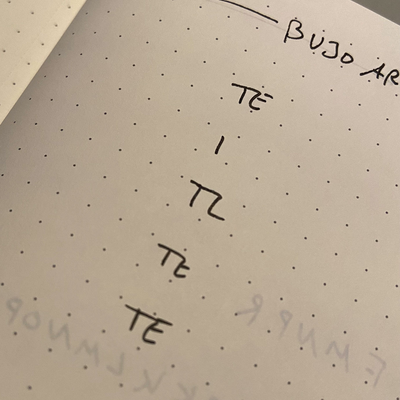
Take for example a T followed by an E (TE): the horizontal line of the T can be extended to become the upper horizontal stem for the E. This saves me one stroke, one action of lifting the pen. This may sound silly, but the more of these improvements I embrace, the faster my handwriting will become. I want to write a little faster because I sometimes notice my thoughts are well ahead of my writing, which can become annoying when I want to write a lot.
I quickly moved into using CAPITALS exclusively
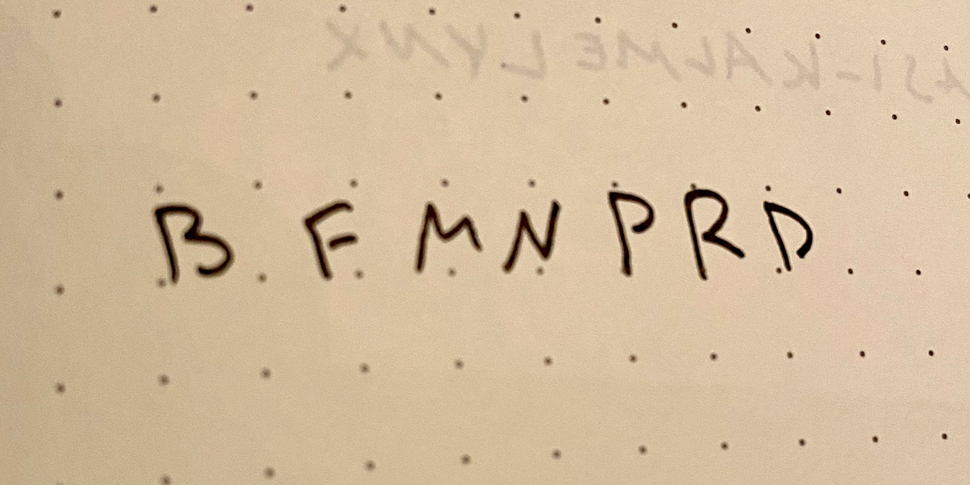
Additionally, I do not like to follow a stroke’s path twice, like I used to do with writing the D: start at the upper left, move the pen down, up the same path and then make the arch. Now I start at the left bottom, go straight up and then create the arch. I’ve optimized this approach for the letters B, F, M, N, P, R as well and breaks with the default “start at the upper left” rule I appear to live by.
One could suggest to move even further into writing some secret shorthand language, which I considered, but I want it to stay readable, there are no secrets in my Bullet Journals.
Recenly though, I’m thinking about introducing symbols for certain recurring words or write shorthands for tedious long Dutch words like MISSCHIEN (maybe) which could very understandibly be short handed into MSSCH. A subject to do some additional research for, which might lead to a new article here!